
Today, people tend to access the internet from their smartphones more often than ever. According to comScore’s Global Digital Future in Focus 2018 report, internet users now spent twice as much time consuming digital media on mobile than on desktop in most countries.
Although most folks browse the web using their smartphones, mobile conversion rates are still lagging behind. Monetate’s Ecommerce 2018 Q2 report shows buyers are more than two times more likely to convert when accessing websites via a tablet or computer.
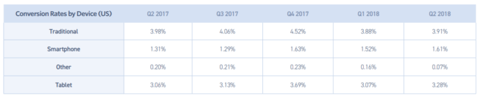
Source: Monetate.
The internet looks different on every device. Mobile is no exception.
Here are five tips that will help make your mobile websites look terrific and increase those conversion rates.
Opt for mobile-first design – not responsive
It’s no secret that Google encourages mobile-first websites. They are faster, easier to navigate and look great on mobile. Some case studies also suggest they convert mobile visitors better, too.
If you’ve ever surfed the web on your mobile phone, you probably know why Google advocates better mobile experiences. Microscopic texts, tiny buttons, unclear forms and endless scrolling create nuisances that are impossible to ignore. Even when do you want to purchase something, it often just gets too frustrating.
Responsive design is a common remedy to make websites mobile-friendly. While it is the easiest and most universal solution in theory, in practice it hurts your mobile conversion rates.
The mobile experience is different from the desktop because smartphone users interact with your site in distinct ways. As Convince and Convert put it several years ago, “Responsive sites have too much content and are too distracting to notice any increase conversions.” If you want to convert mobile users, resizing and rearranging the same content with responsive design won’t do the job. You have to optimize your website for mobile completely.
It’s only natural that most agencies and webmasters went for responsive design in the past. The addition of a mobile-only website was just too much trouble, and both desktop and mobile sites had to be updated simultaneously. However, creating and managing a separate mobile-only site isn’t as difficult as it used to be.
Source: Website Tool Tester.
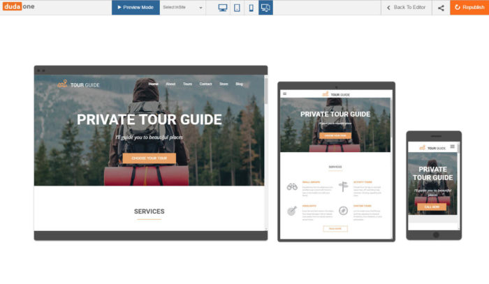
For example, Duda is a smart mobile website design platform for agencies and individuals with several key features that are especially powerful for managing mobile website builds and updates while maintaining scalability. What’s more, all websites built with Duda are lightning-fast, work well on different devices and can easily be deployed as progressive web apps as well.
Duda and similar sophisticated tools can save you lots of trouble and time in the mobile era.
Make use of the magic of personalized content
If you’re willing to do what it takes, you should personalize your marketing and content.
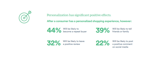
Think with Google’s research shows 61% of users are more likely to buy from websites that serve up personalized content based on location.
Besides, according to Segment, 40% of the U.S. has purchased more than initially planned due to a personalized experience.
Source: Segment.
Mobile allows for many impressive personalized features, like recommendations based on location, device, time, customer groups, campaigns and similar variables.
Evergage is one of the best personalization services for your website. It tracks and analyses your visitors’ behavior for the right recommendations, messages, offers and incentives at the right time. If you’re unsure how to go about personalizing your site, investing in tools like Evergage can boost your engagement and sales.
Put those customer profiles to good use and personalize your visitors’ experience. It pays off.
Analyze incoming traffic
Whether on mobile or desktop, conversion rates often reflect one key aspect of sales: how well you know the site’s users.
Getting people to visit a site is just a start. The more important side of the equation here is, what types of visitors are you attracting, and what do they hope to accomplish once they’re on your pages?
To answer these questions, analyze incoming traffic, outline different segments and create customer profiles. It will help you to discover the best opportunities based on customer behavior.
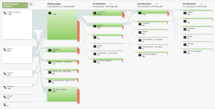
When inspecting traffic, use handy tools like Google Analytics. For example, the Google Analytics Users Flow report helps identify where leads are coming from and what they do on the website.
Source: Bonfire Marketing.
Also, pay attention to the site’s bounce rate. If visitors leave instead of exploring, it indicates misalignment between audience expectations and your delivery.
This type of analysis will help you to construct better ads, more relevant content and an optimized user journey.
Revive abandoned shopping carts
Abandoned shopping carts are the greatest enemy of B2C conversion rates.
At this point, the average documented online shopping cart rate stands at 69.89%. Even worse, people are less likely to buy on mobile. A study by UEA reveals users experience “emotional ambivalence” when shopping on their phones.
In the words of researcher Dr. Korfiatis:
People think differently when they use their mobile phones to make purchase. The smaller screen size and uncertainty about missing important details about the purchase make you much more ambivalent about completing the transaction than when you are looking at a big screen.
You need a good strategy to nudge those ripe prospects. After all, typically they’re just one step away from the checkout. The best way to do it is by sending them a timely reminder while they’re still motivated to buy. A follow-up email with a discount is a proven method. Media Shower reports such messages are opened at 46% rate and close the deal 5% of the time.
Also, UEA researchers recommend making the checkout process on mobile as clean as possible and adding extra incentives to encourage the buyers. If you’re in the business of building or managing ecommerce sites, make sure to include only necessary elements on a limited screen and add extra coupons or discounts during the checkout stage to prompt the shoppers to finish what they started.
Test everything you can
The number one rule of CRO gurus is “assume nothing and test everything.”
If a website drives conversions on desktop, it’s likely that you’ll have a set of assumptions about why. It’s also likely that a handful of those assumptions are wrong on mobile.
For instance, you might have designed a killer pop-up that does great on bigger screens but ruins the mobile UX. Or maybe you’ve developed a unique upselling sequence that works great on desktop, but only increases the friction on mobile. There’s only one way to figure it out – test it.
Mobile is a newer frontier, so you have to test for the best possible results continuously. Even if your mobile site is already up and running, it’s never too late to check your presumptions.
Source: Impactbnd.
Conversion rate optimization, whether for desktop or mobile, is a never-ending cycle of improvement:
- Capture a measure performance.
- Identify issues.
- Come up with possible improvements.
- Test them.
- Implement the changes that boosted conversions and restart the cycle.
“The medium is the message.”
When Marshall McLuhan coined this adage in 1964, he meant that the medium shapes society not only with the message delivered but also with the characteristics of the medium itself.
Mobile is the new medium whose characteristics can no longer be ignored.
If you optimize digital experiences to match the expectations of mobile users, the websites that your business designs will see far more business success, keeping your clients coming back for more.


