HTML5 in conjunction with JavaScript and other powerful mediums is considered to provide the most similar perspectives and possibilities to Flash. While the latter almost lost its power (less and less developers resort to employing this technology) HTML5-powered websites are carved out a distinctive niche, and effectively exploit as well as secure it.
Websites that skillfully adopt HTML5 are easy to spot. They are dynamic and sophisticated; most of them have different transition effects that accompany various widgets emergence. Driven by intelligence of the latest language specification, websites take unconventional approaches, implement unorthodox layouts and provide visitors with a good user’s experience. Moreover, such sites in general are fast and lightweight (that are another important benefits) so Google as well as other search engines extremely favors them, giving them a higher priority.
The list below covers fresh representative examples of astonishing HTML5-based website design examples hat leverage this technique to enrich their designs and make them alive.
HTML5 Websites Examples
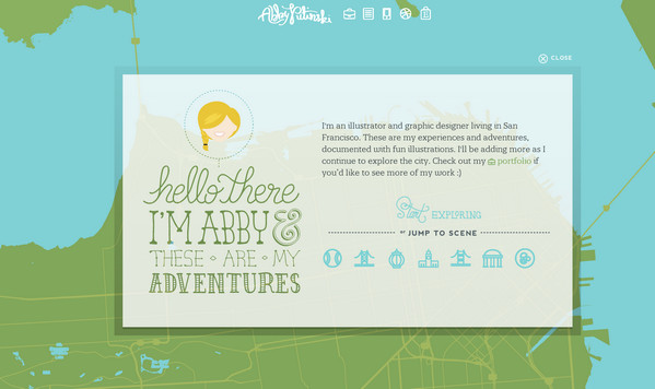
Abby Putinski has an advanced and enthralling website that immediately gives a notion of its very talented owner. The home page includes a clean vector interactive map with lots of cool graphical stuff.
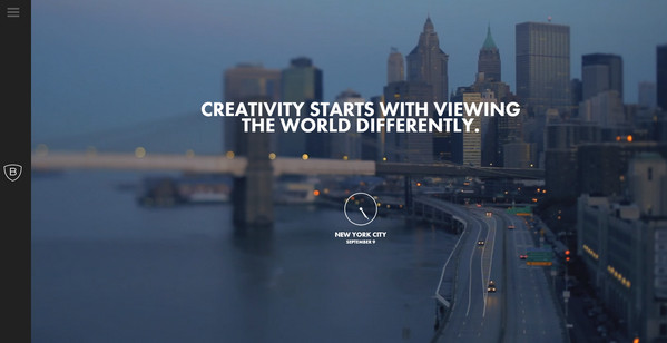
Bienville Capital Management. The website instantly engages the users by its clever dynamic home page that displays spectacular New York scene. It skillfully makes use of a dark coloring to vigilantly craft the whole design.
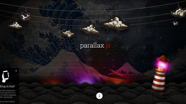
Parallax is a fantastic and dynamic website that is aimed to promote a very helpful plugin, developed for easily incorporating a parallax effect into various projects. The front page clearly demonstrates the technique of swift reaction to orientation changing.
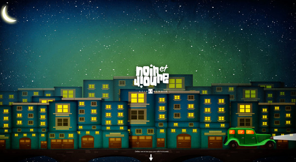
Noir et Renoir is an eye-catching website of a creative digital agency. Its design heavily relies on an unconventional approach of storytelling that naturally invites users into actions.
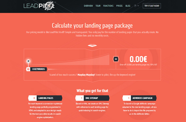
Lead Pilot looks clean and tidy. The designer ably livens up the website with a great deal of dynamic touches, adding to the design a special zest.
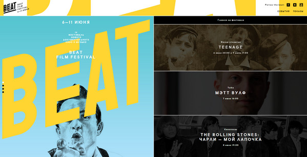
Beat Film Festival has a bright and exceptional promotional website. The front page is neatly sliced into 2 even parts that effectively familiarize users with all the necessary data.
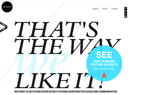
Neotokio. Here the designer wisely puts HTML5 to work in order to create a neat and elegant online portfolio that not only has a pristine well-balanced appearance but also almost literally keep the theme alive.
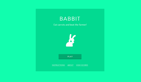
Hover Studio does a great job of attracting users as well as unobtrusively making them stay at least for a while by means of a small engrossing HTML5 game. The latter is based on a positive neon green background and leverages a funny animated illustration of a bunny.
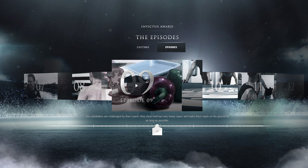
Invictus skillfully establishes the proper sportive atmosphere in order to efficiently highlight the idea behind the website and greatly intensify videos and participants.
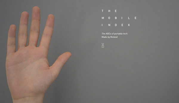
The Mobile Index. The website is intended to familiarize regular users with the basic terms of mobile development, effectively providing readers with a list of essential designation that are presented in an alphabetical order
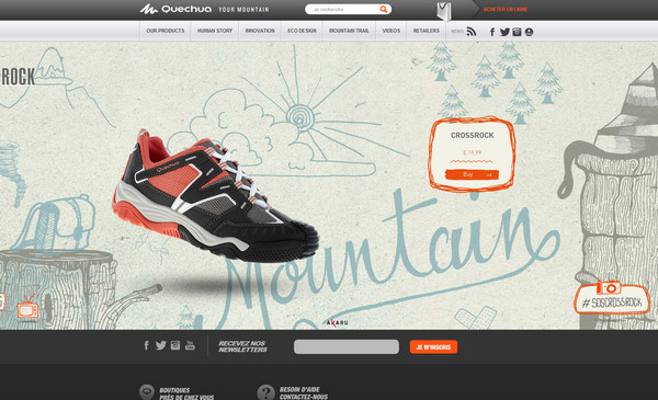
Quechua’s home page features an exciting monochrome vector illustration inspired by nature. The designer perfectly incorporates integral buttons and navigation into this picturesque scene, adding to them a sense of motion.
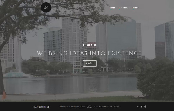
We are SPRY. The website includes a set of short urban videos, which in conjunction with ultra-thin refined typography and neat outline graphics wonderfully enhances a visual experience
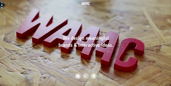
Waaac. Much like the previous example, this website also utilizes different short videos that warmly welcome readers of the website. Every section comprises dynamic components that shed a light on an agency work.
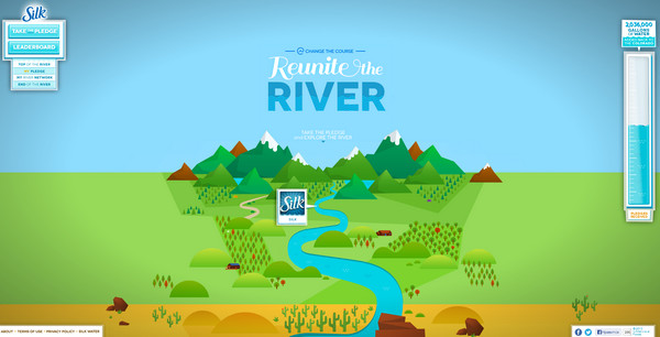
Reunite the River. The designer effectively adopts a modern approach of storytelling to raise the question of the drying up of the Colorado River. The website offers to play a simple game in order to graphically solve this problem.
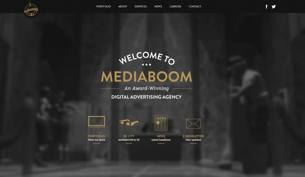
Media Boom skillfully utilizes video as a firm background for emphasizing tagline, navigation and other essential components. Although the website is slightly overloaded with videos and cinemograph, it still works quite efficiently.
Reflection
Thanks to HTML5 many websites become more engrossing, zingy, and certainly dynamic. With advanced techniques you can keep your theme animated, making interaction between your website and users more effective, and adding to the website interactivity that naturally draws attention.




 All Websites Should Feature Videos and Here’s Why
  Creative Dissection Puzzles with CSS and SVG
  Review + Giveaway: MotoCMS Responsive Website Creator
  [Review + Giveaway] 5 Developer’s Licenses for Simplemaps.com ($2495 Combined Value)
  Reviewing Jumerix Multipurpose Joomla Template
Faraz Ahmad Oct 1, 2013, 5:02 pm
These are beautiful and unique website, nice collection.