Topic: HTML / CSS3
Difficulty: Beginner
Estimated Completion Time: 30 mins
Navigation menus are a vital part of today’s websites and designs. Without them functioning correctly, visitors would be lost and our websites would lose one great feature. When it comes to navigation menus, you have to be sure they work well, look great and are suitable for all the major web browsers.
In this tutorial I will be showing how to make minimal CSS3 navigation menu that can be customized to fit your projects requirements and looks.
CSS3 Navigation Menu
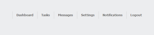
STEP 1 – HTML Markup
To start off, we will need to add our HTML markup. The markup is super simple and the HTML we will be using would be in any simple website menu. Now, I included the notification badges in my menu; If you would like to remove the badges all is needed is to simply remove the badge tags in your HTML.
<html>
<head>
</head>
<body>
  <div>
    <nav>
      <ul>
        <li><a href="#">Dashboard</a></li>
        <li><a href="#">Tasks<span>4</span></a></li>
        <li><a href="#">Messages<span>8</span></a></li>
        <li><a href="#">Settings<span>15</span></a></li>
        <li><a href="#">Notifications<span>16</span></a></li>
        <li><a href="#">Logout</a></li>
      </ul>
    </nav>
  </div>
</body>
</html>
Now that we have the basic HTML done, go ahead and create another file in the same directory as your HTML; I named mine style.css. Next we’ll simply link the HTML to the CSS stylesheet. All you have to do is add the code below in between the two header tags in your HTML. Make sure you replace the location and name if needed.
<link rel="stylesheet" type="text/css" href="style.css">
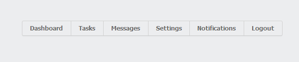
STEP 2 – Layout with CSS
Now that we are finished with the HTML, we will now need to create the CSS in the file we made a bit earlier. The first CSS code will style the layout and body for the menu on the webpage. I added some fonts that will style the menu a little later, change this and the colors to your liking.
@import "http://cdnjs.cloudflare.com/ajax/libs/meyer-reset/2.0/reset.css";
body {
  font: 13px/20px "Lucida Grande", Tahoma, Verdana, sans-serif;
  color: #404040;
  background: #ecedef;
}
We will then create the layout so the menu is not all over the webpage by adding the CSS code below.
.container {
  margin: 80px auto 120px;
  width: 640px;
}

nav {
  height: 26px;
  text-align: center;
}
nav ul {
  border-width: 1px;
  border-style: solid;
  border-color: #d5d5d5 #d2d2d2 #cdcdcd;
  border-radius: 3px;
  display: inline-block;
  vertical-align: baseline;
  zoom: 1;
  *display: inline;
  *vertical-align: auto;
  -webkit-box-shadow: 0 1px 1px rgba(0, 0, 0, 0.04);
  box-shadow: 0 1px 1px rgba(0, 0, 0, 0.04);
}
To finish off this step, we will then finish the layout for the menu itself.
nav li {
  float: left;
  border-left: 1px solid #d2d2d2;
}

nav li:first-child {
  border-left: 0;
}

nav li:first-child a {
  border-radius: 3px 0 0 3px;
}

nav li:last-child a {
  border-radius: 0 3px 3px 0;
}
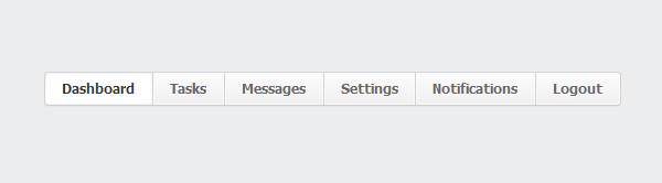
STEP 3 – Beginning the Looks of Our Menu
What’s a menu without a good and clean look? Let’s now begin the process of creating the actual looks of the menu. Start by adding the small code below to your CSS menu. This small peice of CSS will style the menu border, border location, height, the size and color of our font and our text shadow and clarity.
nav a {
  display: block;
  position: relative;
  padding: 0 14px;
  height: 26px;
  line-height: 26px;
  font-size: 11px;
  font-weight: bold;
  color: #666;
  text-decoration: none;
  text-shadow: 0 1px white;
Now, you may want to add a background within the parameter of our menu border. Let’s do this by adding the CSS below into the next line right after text-shadow element line.
background: #fafafa;
  background-image: -webkit-linear-gradient(top, #fcfcfc, #f0f0f0);
  background-image: -moz-linear-gradient(top, #fcfcfc, #f0f0f0);
  background-image: -o-linear-gradient(top, #fcfcfc, #f0f0f0);
  background-image: linear-gradient(to bottom, #fcfcfc, #f0f0f0);
  -webkit-box-shadow: inset 0 0 0 1px #fafafa;
  box-shadow: inset 0 0 0 1px #fafafa;
}
STEP 4 – Menu Hover and Active Page Highlight
Now that we have the general look of our menu we have all but two more vital additions we need to build unto our menu: the menu hover and the active page highlight. The menu hover will add shading around the navigation item the mouse is hovering over, the active page highlight will highlight the page you are currently browsing. These to additions are totally optional but, they give the menu a nice feature. We can now add the menu hover with the code below, feel free to customize the colors to your liking.
nav a:hover {
  color: #333;
  z-index: 2;
  -webkit-box-shadow: inset 0 0 0 1px #fafafa, 0 0 3px rgba(0, 0, 0, 0.3);
  box-shadow: inset 0 0 0 1px #fafafa, 0 0 3px rgba(0, 0, 0, 0.3);
}
We can now finish up the main design of the menu by adding the active page highlight. Now, this is a pretty simple menu feature so, not much need to explain.
nav li.active a, nav a:active {
  color: #333;
  background: white;
  -webkit-box-shadow: inset 0 0 3px rgba(0, 0, 0, 0.1);
  box-shadow: inset 0 0 3px rgba(0, 0, 0, 0.1);
}
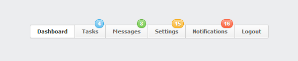
STEP 5 – Optional Notification Badges
If desired, we can now add the notification badges. I kept this out of the main design of the menu, just because the badges commonly are not used in most websites. By adding the CSS below, you will add the layout of the badge or badges.
nav .badge {
  display: block;
  position: absolute;
  top: -12px;
  right: 3px;
  line-height: 16px;
  height: 16px;
  padding: 0 5px;
  font-family: Arial, sans-serif;
  color: white;
  text-shadow: 0 1px rgba(0, 0, 0, 0.25);
  border: 1px solid;
  border-radius: 10px;
  -webkit-box-shadow: inset 0 1px rgba(255, 255, 255, 0.3), 0 1px 1px rgba(0, 0, 0, 0.08);
  box-shadow: inset 0 1px rgba(255, 255, 255, 0.3), 0 1px 1px rgba(0, 0, 0, 0.08);
}
We now may want to add some style and color to these badges. Simply, add and customize this code to your liking and you have an awesome notification badge on your menu. If you would like to add more than one color to your notification badges just add the below code as many times need and change the reference name; In my case it was nav .badge. After adding another badge element in CSS just customize colors and so on to your liking. Be sure to change the reference name in the HTML code!
nav .badge {
  background: #67c1ef;
  border-color: #30aae9;
  background-image: -webkit-linear-gradient(top, #acddf6, #67c1ef);
  background-image: -moz-linear-gradient(top, #acddf6, #67c1ef);
  background-image: -o-linear-gradient(top, #acddf6, #67c1ef);
  background-image: linear-gradient(to bottom, #acddf6, #67c1ef);
}
Conclusion
We’re now finished with our simple but beautiful menu built with CSS3. Remember, you can always customize the CSS to fit the needs of your project. I hope you enjoyed this tutorial and the navigation menu is useful to you and your projects.
Download CSS3 Menu


 Creative Dissection Puzzles with CSS and SVG
  Reviewing Jumerix Multipurpose Joomla Template
  Intense Multipurpose HTML5 Theme – Reviewing Child Themes form an Ever-Growing Monster
  Stand Still is not about Modern Website Design – Rise of Subtle Motion
 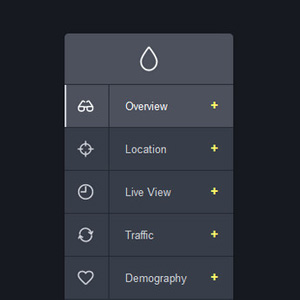 List of Free Scripts for Adding Modern Animated Navigation Menus to your Website
Platform Symphony Aug 27, 2013, 9:32 pm
Great tutorial thanks for posting! CSS3 offers many useful techniques for building navigations both vertical and horizontal. This will surely be of use to some web developers out there.
Amir Sattar Aug 29, 2013, 11:57 am
Great! it’ll help me to develop my admin panel for my website, thanks
Sean Clifford Jan 31, 2015, 12:47 am
Nice tutorial demonstrating css navigation. The notification badge is a nice touch. FYI: Sadly, the download link doesn’t work.
Sergiu Radu Feb 1, 2015, 4:25 pm
Sean, sorry about that. You can download the menu now.