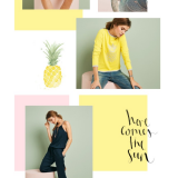
Today we are going to develop how to create a slider, step by step, with images and captions using Square UI bundle kit. It is a great kit with a good selection of colors and it is suitable for someone who is looking to express a modern design, but at the same time an elegant one.
[vc_row][vc_column width=”1/2″] [/vc_column][vc_column width=”1/2″]
 [/vc_column][/vc_row]
What kind of slider we are looking for?
Before starting to write down code, it is important to have a clear idea of the requirements we need to fullfil to create the slider. In order to make it clear, we are going to establish a list of requisites:
- The slider should work automatically till the user clicks on a navigation item.
- Then the animation is stopped and the user can navigate manually.
- The animation should be mainly done using CSS3 Animations and create a fallback for browsers which do not support it.
- If the users looses focus on the current page the slider should get paused in order to save browser memory, no matter if it supports or not CSS3 Animations.
Before starting
Before starting with the layout we should consider the following elements:
- Include jQuery UI in order to animate the navigation items in a similar way that CSS3 Animations does.
- Include from Google Fonts “Monserrat” typography.
- Include Modernizr, I used for this tutorial Html5 Boilerplate, which is included on the framework.
<link rel="stylesheet" href="css/normalize.css">
<!--Including Montserrat font from Google webfonts-->
<link href='http://fonts.googleapis.com/css?family=Montserrat:400,700' rel='stylesheet' type='text/css'>
<link rel="stylesheet" href="css/main.css">
<!--Including Modernizr custom for checking CSS3 Animation support-->
<script src="js/vendor/modernizr-2.6.2.min.js"></script>
Setting the Layout
We are going to set the layout using a div as wrapper at 100% of document width, then inside it we are going to define an article where we are going to include the slider.
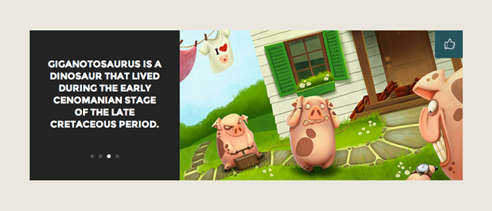
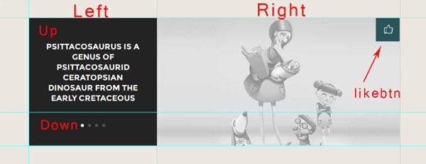
The slider contains the following main regions inside it:
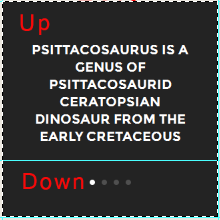
- Left: there are two more regions inside it, on top is “up” where the messages are displayed and at bottom “down” where navigation items are located.
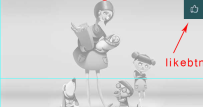
- Right: the list of images and the like button.
Here is the code for the layout:
<div id="wrapper">
    <article class="featured">
        <div class="slider-wrapper">
            <div class="left">
                <div class="up">
                    <ul class="message">
                        <li>Psittacosaurus is a genus of psittacosaurid ceratopsian dinosaur from the Early Cretaceous</li>
                        <li>Tyrannosaurus rex was a fierce predator that walked on two powerful legs</li>
                        <li>Giganotosaurus is a dinosaur that lived during the early Cenomanian stage of the Late Cretaceous Period.</li>
                        <li>Velociraptor is a dinosaur that lived during the later part of the Cretaceous Period.</li>
                    </ul><!--message-->
                </div><!--up-->
                <div class="down">
                    <ul class="nav">
                        <li class="first selected"></li>
                        <li class="second"></li>
                        <li class="third"></li>
                        <li class="fourth"></li>
                    </ul><!--nav-->
                </div><!--down-->
            </div><!--Left-->
            <div class="right">
                <ul class="image-holder">
                    <li><img src="img/firstslide.jpg" alt="first slide"/></li>
                    <li><img src="img/secondslide.jpg" alt="second slide"/></li>
                    <li><img src="img/thirdslide.jpg" alt="third slide"/></li>
                    <li><img src="img/fourthslide.jpg" alt="fourth slide"/></li>
                </ul><!--Image Holder-->
                <div class="likebtn">

                </div><!--likebtn-->
            </div>

        </div><!--Slider-Wrapper-->
    </article><!--featured-->
</div><!--Wrapper-->
There are some things to remark on the layout, specially about the ul class nav items. As it can be seen they have a class for each in order to animate them one by one per time using CSS3, this can be understood when we are going to talk about CSS.
Finally, the first item in the navigation menu has the class selected in order to emulate the change of colors gradually on browsers without support to CSS3.
The CSS
As I chose as framework Html5 Boilerplate, I am not going to refer to any css reset.
I have placed my code in Author´s custom styles in main.css. First we are going to focus in the main structures as the body wrapper, article and the div with class slider-wrapper.
body {
    background: #ebe7df;
}

#wrapper {
    width: 100%;
    padding: 60px 0;
}

article.featured {
    margin: 0 auto;
    width: 935px;
}

.slider-wrapper {
    width: 935px;
    height: 324px;
    overflow: hidden;
}
Then our seal will be emphasized on the left side of our layout.
Here is where animation with CSS3 are done, ul class message and each of the li of ul class are animated using keyframe property:
/* Left part of the slider*/

.left {
    background: #232323;
    float: left;
    height: 324px;
    width: 324px;
}

.up {
    height: 156px;
    margin: 60px 0 0;
    overflow: hidden;
    padding: 0 38px;
}

.up ul.message, .right ul.image-holder {
    margin: 0;
    padding: 0;

}

.up ul.message{
    position: relative;
     animation: textanimation 36s infinite;
    -moz-animation: textanimation 36s infinite; /* Firefox */
    -webkit-animation: textanimation 36s infinite; /* Safari and Chrome */
    -o-animation: textanimation 36s infinite; /* Opera */
    animation-timing-function:ease-in-out;
    animation-direction:alternate;
    -webkit-animation-direction:alternate; /* Safari and Chrome */
    animation-delay: 4s; /* W3C and Opera */
    -moz-animation-delay: 4s; /* Firefox */
    -webkit-animation-delay: 4s; /* Safari and Chrome */
}

@keyframes textanimation {
0%   {top: 0px;}
33.333334%  {top: -216px;}
66.666667%  {top: -432px;}
100%  {top: -648px;}
}

@-moz-keyframes textanimation /* Firefox */
{
0%   {top: 0px;}
33.333334%  {top: -216px;}
66.666667%  {top: -432px;}
100%  {top: -648px;}
}

@-webkit-keyframes textanimation /* Safari and Chrome */
{
0%   {top: 0px;}
33.333334%  {top: -216px;}
66.666667%  {top: -432px;}
100%  {top: -648px;}
}

@-o-keyframes textanimation /* Opera */
{
0%   {top: 0px;}
33.333334%  {top: -216px;}
66.666667%  {top: -432px;}
100%  {top: -648px;}
}

.up ul.message li {
    color: #FFFFFF;
    font-family: 'Montserrat';
    font-size: 20px;
    font-weight: 700;
    height:216px;
    line-height: 26px;
    list-style: none outside none;
    text-align: center;
    text-transform: uppercase;
    width: 248px;

}

.down {
    padding: 52px 38px;
}

.down ul.nav {
    margin: 0 auto;
    padding: 0;
    width: 62px;
    height: 8px;
 }

.down ul.nav li {
    float: left;
    width: 8px;
    height: 8px;
    background: #4f4f4f;
    -webkit-border-radius: 50%;
    border-radius: 50%;
    margin: 0 10px 0 0;
    cursor: pointer;
    display: block;
}

/* Each navigation item is animated individually */

.down ul.nav li.first {
    animation: navanimation1 36s infinite;
    -moz-animation: navanimation1 36s infinite; /* Firefox */
    -webkit-animation: navanimation1 36s infinite; /* Safari and Chrome */
    -o-animation: navanimation1 36s infinite; /* Opera */
    animation-direction:alternate;
    -webkit-animation-direction:alternate; /* Safari and Chrome */
    animation-delay: 4s; /* W3C and Opera */
    -moz-animation-delay: 4s; /* Firefox */
    -webkit-animation-delay: 4s; /* Safari and Chrome */
}

@keyframes navanimation1 {
0%   {background: #fff;}
33.333334%  {background: #4f4f4f;}
66.666667%  {background: #4f4f4f;}
100%  {background: #4f4f4f;}
}

@-moz-keyframes navanimation1 /* Firefox */
{
0%   {background: #fff;}
33.333334%  {background: #4f4f4f;}
66.666667%  {background: #4f4f4f;}
100%  {background: #4f4f4f;}
}

@-webkit-keyframes navanimation1 /* Safari and Chrome */
{
0%   {background: #fff;}
33.333334%  {background: #4f4f4f;}
66.666667%  {background: #4f4f4f;}
100%  {background: #4f4f4f;}
}

@-o-keyframes navanimation1 /* Opera */
{
0%   {background: #fff;}
33.333334%  {background: #4f4f4f;}
66.666667%  {background: #4f4f4f;}
100%  {background: #4f4f4f;}
}

.down ul.nav li.second {
    animation: navanimation2 36s infinite;
    -moz-animation: navanimation2 36s infinite; /* Firefox */
    -webkit-animation: navanimation2 36s infinite; /* Safari and Chrome */
    -o-animation: navanimation2 36s infinite; /* Opera */
    animation-direction:alternate;
    -webkit-animation-direction:alternate; /* Safari and Chrome */
    animation-delay: 4s; /* W3C and Opera */
    -moz-animation-delay: 4s; /* Firefox */
    -webkit-animation-delay: 4s; /* Safari and Chrome */
}

keyframes navanimation2 {
0%   {background: #4f4f4f;}
33.333334%  {background: #fff;}
66.666667%  {background: #4f4f4f;}
100%  {background: #4f4f4f;}
}

@-moz-keyframes navanimation2 /* Firefox */
{
0%   {background: #4f4f4f;}
33.333334%  {background: #fff;}
66.666667%  {background: #4f4f4f;}
100%  {background: #4f4f4f;}
}

@-webkit-keyframes navanimation2 /* Safari and Chrome */
{
0%   {background: #4f4f4f;}
33.333334%  {background: #fff;}
66.666667%  {background: #4f4f4f;}
100%  {background: #4f4f4f;}
}

@-o-keyframes navanimation2 /* Opera */
{
0%   {background: #4f4f4f;}
33.333334%  {background: #fff;}
66.666667%  {background: #4f4f4f;}
100%  {background: #4f4f4f;}
}

.down ul.nav li.third {
    animation: navanimation3 36s infinite;
    -moz-animation: navanimation3 36s infinite; /* Firefox */
    -webkit-animation: navanimation3 36s infinite; /* Safari and Chrome */
    -o-animation: navanimation3 36s infinite; /* Opera */
    animation-direction:alternate;
    -webkit-animation-direction:alternate; /* Safari and Chrome */
    animation-delay: 4s; /* W3C and Opera */
    -moz-animation-delay: 4s; /* Firefox */
    -webkit-animation-delay: 4s; /* Safari and Chrome */
}

keyframes navanimation3 {
0%   {background: #4f4f4f;}
33.333334%  {background: #4f4f4f;}
66.666667%  {background: #fff;}
100%  {background: #4f4f4f;}
}

@-moz-keyframes navanimation3 /* Firefox */
{
0%   {background: #4f4f4f;}
33.333334%  {background: #4f4f4f;}
66.666667%  {background: #fff;}
100%  {background: #4f4f4f;}
}

@-webkit-keyframes navanimation3 /* Safari and Chrome */
{
0%   {background: #4f4f4f;}
33.333334%  {background: #4f4f4f;}
66.666667%  {background: #fff;}
100%  {background: #4f4f4f;}
}

@-o-keyframes navanimation3 /* Opera */
{
0%   {background: #4f4f4f;}
33.333334%  {background: #4f4f4f;}
66.666667%  {background: #fff;}
100%  {background: #4f4f4f;}
}

.down ul.nav li.fourth {
    animation: navanimation4 36s infinite;
    -moz-animation: navanimation4 36s infinite; /* Firefox */
    -webkit-animation: navanimation4 36s infinite; /* Safari and Chrome */
    -o-animation: navanimation4 36s infinite; /* Opera */
    animation-direction:alternate;
    -webkit-animation-direction:alternate; /* Safari and Chrome */
    animation-delay: 4s; /* W3C and Opera */
    -moz-animation-delay: 4s; /* Firefox */
    -webkit-animation-delay: 4s; /* Safari and Chrome */
}

keyframes navanimation4 {
0%   {background: #4f4f4f;}
33.333334%  {background: #4f4f4f;}
66.666667%  {background: #4f4f4f;}
100%  {background: #fff;}
}

@-moz-keyframes navanimation4 /* Firefox */
{
0%   {background: #4f4f4f;}
33.333334%  {background: #4f4f4f;}
66.666667%  {background: #4f4f4f;}
100%  {background: #fff;}
}

@-webkit-keyframes navanimation4 /* Safari and Chrome */
{
0%   {background: #4f4f4f;}
33.333334%  {background: #4f4f4f;}
66.666667%  {background: #4f4f4f;}
100%  {background: #fff;}
}

@-o-keyframes navanimation4 /* Opera */
{
0%   {background: #4f4f4f;}
33.333334%  {background: #4f4f4f;}
66.666667%  {background: #4f4f4f;}
100%  {background: #fff;}
}

.down ul.nav li:last-child {
    margin: 0;
}

ul.nav li.selected {
    background:#fff;
}
At the end we find the right part regarding the images and the like button. The ul containing the images is animated using CSS3 and the mentioned button is placed absolutely with no function, but you can attach to it any plugin to share the picture visible in that moment.
/* Right part of the slider */

.right {
    float: right;
    width: 611px;
    height: 324px;
    overflow: hidden;
    position: relative;
}

.right ul.image-holder {
    position: relative;
    animation: imganimation 36s infinite;
    -moz-animation: imganimation 36s infinite; /* Firefox */
    -webkit-animation: imganimation 36s infinite; /* Safari and Chrome */
    -o-animation: imganimation 36s infinite; /* Opera */
    animation-timing-function:ease-in-out;
    animation-direction:alternate;
    -webkit-animation-direction:alternate; /* Safari and Chrome */
    animation-delay: 4s; /* W3C and Opera */
    -moz-animation-delay: 4s; /* Firefox */
    -webkit-animation-delay: 4s; /* Safari and Chrome */
}

.right ul.image-holder li {
    list-style: none;
    height: 324px;
}

@keyframes imganimation {
0%   {top: 0px;}
33.333334%  {top: -324px;}
66.666667%  {top: -648px;}
100%  {top: -972px;}
}

@-moz-keyframes imganimation /* Firefox */
{
0%   {top: 0px;}
33.333334%  {top: -324px;}
66.666667%  {top: -648px;}
100%  {top: -972px;}
}

@-webkit-keyframes imganimation /* Safari and Chrome */
{
0%   {top: 0px;}
33.333334%  {top: -324px;}
66.666667%  {top: -648px;}
100%  {top: -972px;}
}

@-o-keyframes imganimation /* Opera */
{
0%   {top: 0px;}
33.333334%  {top: -324px;}
66.666667%  {top: -648px;}
100%  {top: -972px;}
}

/* Like Button */

.likebtn {
    position: absolute;
    right: 0;
    top: 0;
    cursor: pointer;
    height: 60px;
    width: 60px;
    background: url("../img/likebutton.jpg") no-repeat;
}
The Scripts
Here we are going to find the script placed inside folder “js” in the file named “main.js” to stop and resume the slider when it is showing the different images and messages. Besides we can simulate the same animation with Jquery animate method on browsers which does not support CSS3. In order to know if the user´s browser can support the CSS3 features we use Modernizr.
Besides, here you can find the code to navigate manually the slider after the user clicks on a nav item, so the animation (CSS3 one or via Javascript) is stopped, and the message and image with the same index of navigation item are displayed.
There is a point to clarify regarding the fallback we are supplying for browsers which does not support CSS3 natively. The slider on those browsers works in a similar way than the automatic animation we have developed for more capable browsers. The idea is to supply to a user for example, of IE9 a very close experience that a Chrome user can have, not the same, but closer as possible using another technology.
$(document).ready(function() {

	stopAnimation();

	navOnClick();

});//Ready

//Variables Definition

var navItems = $('ul.nav li'); //The items which show slider animation status

var msgHolder = $('ul.message');//Ul which contains the messages list

var imageHolder = $('ul.image-holder');//Ul which contains the list items with images

var liQuantity = $('ul.image-holder li').length; //Quantity of all the items to be animated for each group

//I chose the image holder quantity but i could take navItems or messages quantity.

var liHeight = $('ul.image-holder li').height(); //Images height is stored

var liHeightMsg = $('ul.message li').height();	//Messages height is saved

var i = 1; //i represents a index of navItems, it is initialized on 1 because the animation starts moving

//the second item on the list.

var direction = true; //It tells in which direction the animation goes. True represent a way and false its opposite.

var navStatus = true; //This variable is set as a switcher, because the clearInterval

//function is used to stop a Javascript based animation when the user looses

//focus on the current window, but in order to stop that animation  definitely, this variable is set to false.

//The following variables are set null in order to store values afterwards

var imgSlider = null; //It stores the setInterval function which creates a Javascript based animation

//on browsers which does not support CSS3 animations

var prevIndex = null; //This variable checks if a same navItem is clicked twice.

//stopAnimation aims to stop the animation when the user looses focus
//the current Window.

function stopAnimation() {

	//First it is tested if the browser supports css animations

	if(Modernizr.cssanimations){

		//If the test outcome is true we set  two functions:

		//First when user looses focus on current window we stop the CSS3 Animation using
		//animation-play-state paused

		//Since some browsers only accept vendor prefixes and do not
		//"read" the regular property we should prepare both posibilities
		//we could face conflicts in the console.
		$(window).blur(function(){

			$(navItems).css("animation-play-state","paused");
			$(navItems).css("-webkit-animation-play-state","paused");
			$(msgHolder).css("animation-play-state","paused");
			$(msgHolder).css("-webkit-animation-play-state","paused");
			$(imageHolder).css("animation-play-state","paused");
			$(imageHolder).css("-webkit-animation-play-state","paused");

		})//Window

		//When the user recovers focus on current window the CSS3 Animation resumes

		$(window).focus(function(){

			$(navItems).css("animation-play-state","running");
			$(navItems).css("-webkit-animation-play-state","running");
			$(msgHolder).css("animation-play-state","running");
			$(msgHolder).css("-webkit-animation-play-state","running");
			$(imageHolder).css("animation-play-state","running");
			$(imageHolder).css("-webkit-animation-play-state","running");

		})//Window

	} else{

			//Animation for Browsers which do not support CSS3 Animations

			//Animation function has internally a setInterval function
			//in order to simulate the CSS3 Animation on browsers which do not support
			//that feature natively
			function animation() {

			$(window).focus(function(){
						imgSlider = setInterval(
						function() {
							//we test if the navStatus is true, so the animation
							//can continue.
							if(navStatus == true) {
									//Direction is tested in order to know where the animation
									//is headed to, e.g. for images and messages if they go
									//from from bottom to top or the other way around.
									//Regarding navItems, direction let us know if the animation
									//can go from left to right or vice versa.
									if(direction == true) {
										if(i < liQuantity) {
								                $(imageHolder).animate({
								                    top: "-=" + liHeight+"px"
								                	}, 4000);

								                $(msgHolder).animate({
								                    top: "-=" + liHeightMsg+"px"
								                	}, 4000);

								                navItems.removeClass("selected");
								                navItems.eq(i).addClass("selected", 1000);

							                i++;

								        } else {

								        	direction = false;

								        	i = liQuantity - 2;

								        };

									} else {

										 if(i > 0){

										 	$(imageHolder).animate({
								                top: "+=" + liHeight+"px"
								               	}, 4000);

								            $(msgHolder).animate({
								                top: "+=" + liHeightMsg+"px"
								              	}, 4000);

								            navItems.removeClass("selected");
								            navItems.eq(i).addClass("selected", 1000);

								            i--;

										} else {

											$(imageHolder).animate({
								                top: "+=" + liHeight+"px"
								               	}, 4000);

								            $(msgHolder).animate({
								                top: "+=" + liHeightMsg+"px"
								              	}, 4000);

											navItems.removeClass("selected");
											navItems.eq(i).addClass("selected", 1000);
											direction = true;
											i = 1;

										};

									};

								   };
								}//function imageSlider
						, 4000);

				});//focus

				$(window).blur(function(){

					clearInterval(imgSlider);

				});//blur

		};//Animation

		animation();

	};

};//stopAnimation

//navOnClick  stops any animation on the slider (both CSS3 o Javascript)
//so from the moment that the user clicks on the navigation menu
//at the bottom, he or she can go to any image and sentence of the slider manually.
function navOnClick(){

    $(navItems).on("click", function(){

        //Clicked item is captured in a variable
        var $this = $(this);

        //Then its index is stored in a variable
        var $thisIndex = navItems.index($this);

        //Class named "selected" is removed from the nav items
       	navItems.removeClass("selected");

       	//Class "selected" is place on the item which is clicked by user
		navItems.eq($thisIndex).addClass("selected");

		//This comparison is done in order to avoid triggering a animation several times on
		//a selected item, because it generates a delay when you want to select another
		//item on the menu
		if(prevIndex == $thisIndex) {

			return false;

		} else {

		    //prevIndex takes the same index value of the current selected index
		    //so in the following selection if the same item is selected,
		    //the function will be stopped by return false.
		    prevIndex = $thisIndex;

		    //As the behavior of stopping an animation change if the browser
		    //supports CSS3 Animations or not, we use Modernizr to check browser capabilities
		  	if(Modernizr.cssanimations){

		  		//On browser with support, setting animation none to stop animation forever.
				$(navItems).css("animation", "none");
				$(imageHolder).css("animation", "none").animate({top: "-"+$thisIndex*liHeight+"px"}, 4000);
				$(msgHolder).css("animation", "none").animate({top: "-"+$thisIndex*liHeightMsg+"px"}, 4000);

			}else{

				//As we had used clearInterval to stop Javascript animation when user looses focus on
				//the current window, we change the animation status to false in order to stop it.
				navStatus = false;

				$(imageHolder).animate({top: "-"+$thisIndex*liHeight+"px"}, 4000);
				$(msgHolder).animate({top: "-"+$thisIndex*liHeightMsg+"px"}, 4000);

			};//Modernizr test

		};

    });//Click

};//navOnClick
Conclusion
This slider is suitable for sites which want to show content dynamically and let the user to experiment the navigation through it. Suitable for modern browsers and for those ones without support of CSS3, with strong aim focus on performance, this could be a great option for your next project.


 [Review] YellowPencil – A True Visual CSS Editor for WordPress
  Creative Dissection Puzzles with CSS and SVG
  Reviewing Jumerix Multipurpose Joomla Template
  Prototyping with Proto.io
  Intense Multipurpose HTML5 Theme – Reviewing Child Themes form an Ever-Growing Monster
John Wu Apr 22, 2014, 11:44 am
Why bother providing fallback? It isn’t it good to keep your code clear?
Timmy May 6, 2014, 6:42 pm
Stunning????
That’s quite a stretch!