Nowadays the responsiveness is not an optional feature that needs to be present on your web project; it is literally a must-have without which your website won’t be able to successfully compete with others. Moreover an ability to adapt to different screen sizes whether it is a tiny cell phone, medium tablet or huge monitor screen is crucial for contemporary websites since your design has to look ethically no matter what, and this applies not only to corporate, business or eCommerce websites but also to blogs and online magazines.
We have repeatedly featured various responsive tools starting from slideshows and ending with various frameworks, today is the day when we want to shed a light on free online responsive design testing tools that help to control this characteristic by providing you with handy instruments for testing your upcoming products.
Free Tools for Responsive Design Test your Website on Different Devices
Responsive Design Testing is one of the oldest and time-tested online web tools that provide a standard set of instruments. Although, the functional is slightly limited yet you will still get everything you need for checking responsiveness of your website on most popular devices.
Responsive Test is an advanced but really easy-to-use online tool that will clearly demonstrate a responsive behavior of your project. The tool offers a quite handy grid.
Am I Responsive? is a professional web tool that skillfully checks the adaptive characteristics of your website. All you have to do is to enter your link.
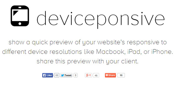
Deviceponsive – The tool skillfully emulates various device sizes such as Galaxy, iPhone, Kindle, iPad and Macbook.
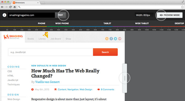
Dimensions App is an advanced checking tool that allows you to test your website even in offline mode. In order to do this you should download an add-on for Google Chrome and simply install it.
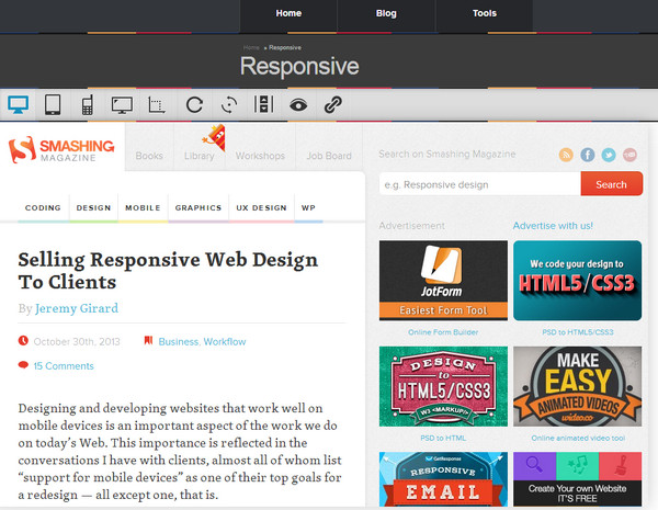
Responsive is another comprehensive tool that enables you to preview your website in various dimensions. The intelligible pictograms and understandable interface make the interaction between you and the tool clear and productive.
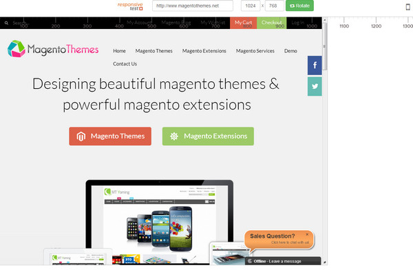
Responsive Test – The tool includes a helpful ruler that graphically displays sizes of various screens. The tool provides you with numerous standard dimensions starting from small cell phones and ending with large desktop monitors.
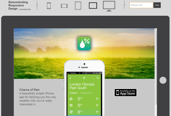
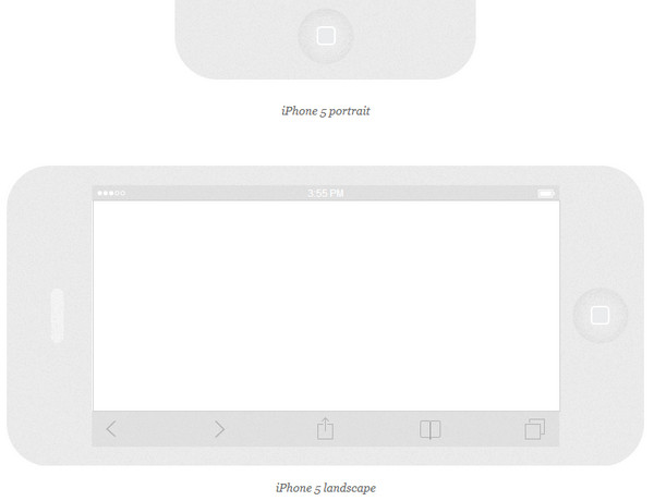
Demonstrating Responsive Design – The tool encloses your web project into a frame that corresponds to popular device. Thus you will be able to preview your website in desktop monitor, iPhone and iPad (the latter two are presented in portrait and landscape modes).
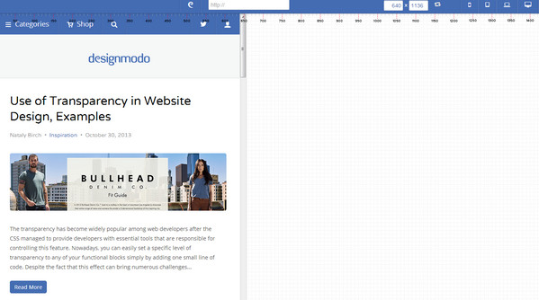
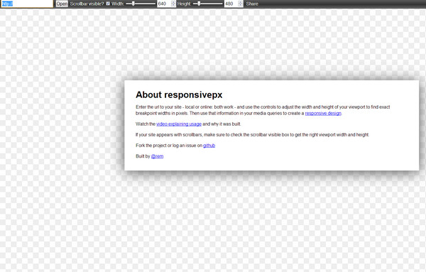
Responsivepx is a simple and interactive online tool that gives you an opportunity to test responsive behavior of your project simply by dragging a scrollbar on the toolbar. You can dynamically change dimensions of your page.
Responsinator is aimed to provide instruments for testing your project on mobile devices and tablets. Thus, you will be able to appreciate the look of your website on iPhone, Android, iPad and Kindle. Every device is presented in portrait and landscape modes.
Responsive Design View – With the help of this tool you can take a look at your web project on different popular sizes.

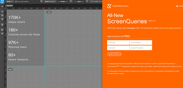
Screenqueri gives an opportunity to test your web project on more than 60 various devices. The tool is still in beta version and is available only for those who have signed up.
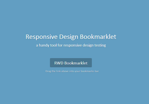
Responsive Design Bookmarklet is a helpful add-on that allows you to monitor the behavior of your website depending on different screen sizes.
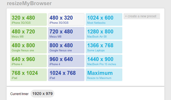
resizeMyBrowser – Much like the first example, this online instrument is one of pioneers of responsive design testing tools. Its goal is to resize browser window depending on specified parameters and as a result, to show how your design will look on it.
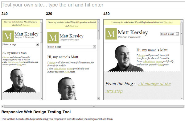
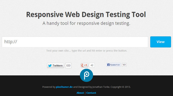
Responsive Web Design Testing Tool – includes only 5 standard dimensions: 320×480, 480×640, 768×1024, and 1200×800.
Reflection
There are numerous free online responsive web design testing tools, and we have collected only the most popular ones. We have included those that provide a standard set of dimensions that is quite sufficient for primary tests, and those that have optional screen sizes for experienced web developers.


 9 Ways to Increase Your ROI in Your Website Design
  [Review + Giveaway] Now UI Kit PRO – Perhaps the Last UI Kit You’ll Ever Need
  Introducing eWebDesign Version 3!
  [Review + Giveaway] Ultra Theme by Themify – How Powerful and Flexible Is It?
  [Review + Giveaway] 5 Developer’s Licenses for Simplemaps.com ($2495 Combined Value)