Any designer knows that colours have the power to „kill” a design project. In the same time, a wise colour combination may considerably improve a project. Colours are part of any project and it’s impossible to neglect them. It would have been fabulous if the choice of colours had respected some objective rules. Unfortunately, picking the right colour is mostly an art. As long as there are almost unlimited colours, it’s pretty clear that there are many good colour choices. Thinking deeper, the dilemmas of the designers became obvious. Yeah, there are many colours, but 99% of the entities in this world aren’t created using a single colour; it’s all about combinations. Willing or not, colours rarely blend together. A designer should take into account many aspects when making a colour combination.
Firstly, each colour must look OK and most important, they must match to the project style. Secondly, the colours must be accepted by the target viewers. Some colours express joy or trust in some cultures, but for other ones these may have completely different meanings. The colours used in the project must “match” with each other and it’s not an easy job to find some “mates”. Finally, the combination must be appreciated by the viewers and must be in accordance with the project style.
In conclusion, a seemingly two minutes job is in fact a quite complicated one. In order to help you take good decisions, I created a list of fresh resources to help the designers make good colour combinations.
Color Spire
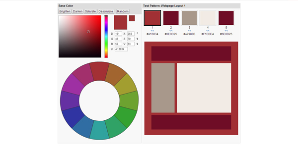
“Color Spire” is a very new tool for colour combinations, but I am sure that it will captivate the attention of the designers. It’s very light and simple to use. It is useful to test the combinations of a layout: you just select the main colour and further play until you are satisfied with the result. “Color Spire” doesn’t offer many features, but the current ones are enough to make a good selection.
Colrd
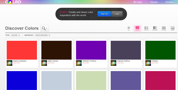
It’s another very fresh resource that, sooner or later, will be discovered by the design community. I have no doubt that it will became a popular website because here you can find a lot of solutions for making a good colour combination. “Colrd” isn’t only about colours. Here you can find many inspirational pictures, but I believe that it would be better to visit it yourself!
Collor
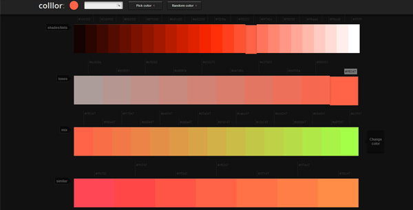
“Collor” is the perfect tool for the designers that want to combine the colours. Just select the colour you have in mind and “Collor” will offer a large palette of colours with which you could make a good combination.
Genopal
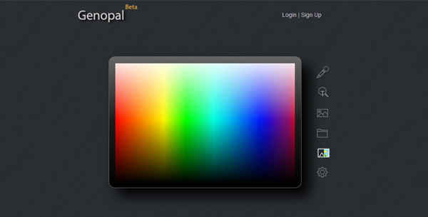
“Genopal” is still in Beta version, but it doesn’t mean that it isn’t very useful. I really appreciate this application because it helps the designers detect the HEX values of a colour by its name. Let’s be honest, the designers, especially the males, have serious trouble with making the differences between the names of colours (i.e., did you know that Mulberry and Neon Carrot are colours?)
Colorhexa
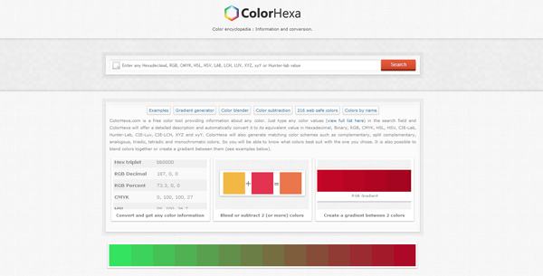
“Colorhexa” is a tool that must be frequently checked by any web designer. It’s extremely simple to use, but it offers a complete analysis of a colour. The idea is simple: just add a colour in the search bar and you will be instantly provided the necessary information.
Pictaculous
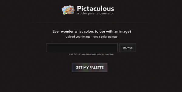
Somehow, “Pictaculous” is similar to “Colorhexa”. Instead of adding a colour, the user adds an image and obtains the colour palette used. Recently, you may do this job using your smartphone by installing the freshly launched application.
TinEye
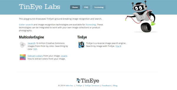
This app is the opposite of “Pictaculous”. The user selects a colour and instantly he may admire tons of images from Flickr that are based on the selected colour. The user still has the possibility of extracting the colours from an image, so you should bookmark this resource.
Colorotate
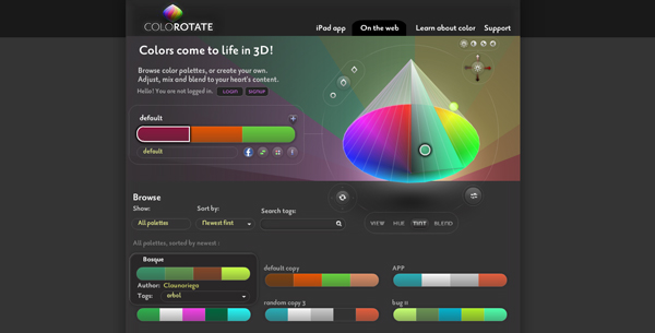
“Colorotate” isn’t quite necessarily a fresh resource, but its iPad version is recently launched. It is a very complex tool that offers a 3D perspective of the colours to use in the projects. Besides that, “Colorotate” offers tons of colour schemes – for inspiration or for use.
Kuler
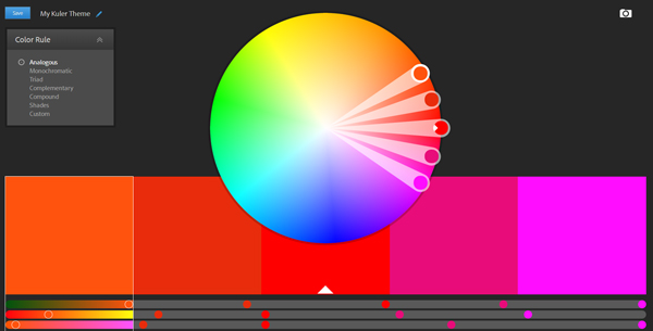
“Kuler” is also not a recently launched web application, but its new design convinced me to add it here. It’s needless to say that it’s one of the best tools for managing the colours as it’s been created by Adobe. You can create various types of colour schemes, save them and get inspired from others.
0to255
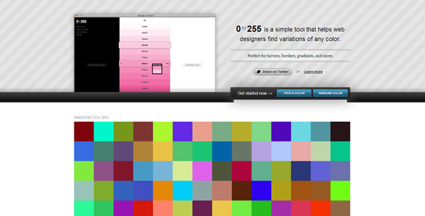
“0to255” is a light application that can any designer help very much. The user selects a colour and the app provides darker and lighter versions of it. Simple, but brilliant, isn’t it?
Color Calculator
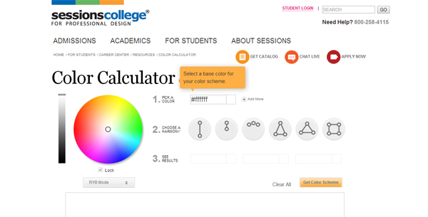
This application is very useful and practically it’s impossible not to understand how it works. The user selects a colour and he/she may obtain various colour schemes depending on the type of the colour combination desired (complementary, analogous, triadic etc). The ones that still haven’t used it shouldn’t worry about it, the explanations presented are detailed and completed.
Perbang
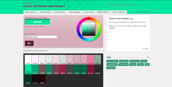
If you aren’t satisfied with the previous application, then you have a second choice. In addition to a great colour scheme picker, “Perbang” offers a lot of information about the colours. This resource should be visited by the amateurs, they can find some precious tips.
Image Color Picker
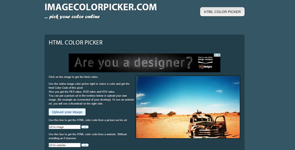
This application is very useful because it saves a lot of time. Instead of using “Photoshop” or other similar software to find out the HTML or RGB code of a colour, you can use “Image Color Picker” and the results are almost instant. Much more, the user has the possibility of extracting the colours from a website by adding the address in the search box.
Pantonism
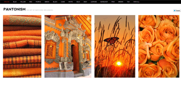
A good colour picker is vital in the work of any designer, but it’s not enough. It’s requires inspiration and it is a very subjective entity: you can’t be inspired whenever you want. Altogether, in order to get inspired I highly recommend checking this website; here you can find tons of images that will surely impress any viewer.
Plenty of Colour
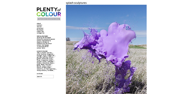
“Plenty of Colour” is a place where any designer can get his daily dose of inspiration. There are posted cool design works that will impress the viewer with the colours used (but not only). It’s a useful resource because the users have the possibility of searching for works that are based on a specific colour.
Design Seeds
“Design Seeds” is awesome! The user can admire wonderfully coloured images and he/she can study its colour palette for future projects.
The Days Color
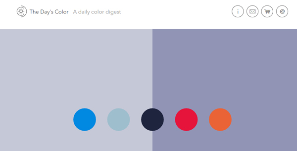
“The Days Color” is a very recent project, but I really consider that it should be bookmarked and used by many designers. It’s about pure inspiration, nothing to distract the user. Its flat design perfectly matches with the idea of the website.
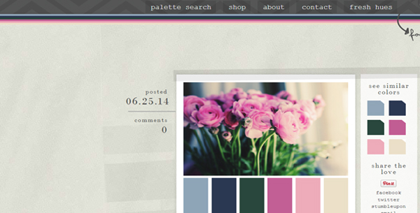
Colour Lovers
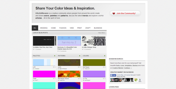
I think that “Colour Lovers” is the most complex resource in this area. To be exact, each practical and theoretical aspect of dealing with colours is fully covered. There are advices and schemes for anyone, from newbie web designers to top experts.
I Want Hue
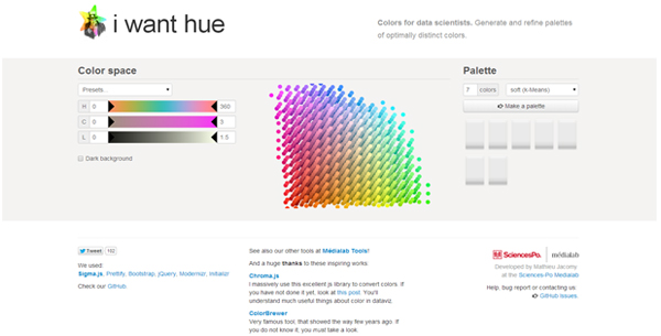
Finally, after so many interesting resources it’s time to practice and delight the future clients with the knowledge gained. “I Want Hue” is a very complex resource that allows creating complex colour palettes. Therefore explore it to impress people!
I hope that you will use some of the resources exhibited in your workflow. Playing with colours is a risky task, but it can’t be avoided. It would be great if you could share with us your opinion on how to deal with colours!


 Freebie: 50 Vector Human Resources Icons
  9 Ways to Increase Your ROI in Your Website Design
  20 Fresh and Beautiful Weather App Concepts
  20 Fresh and Creative Examples of Typography Design
Brad Jul 1, 2014, 9:42 pm
I have used Kular for a long time, but one of my new favorites is Collor. Great app