Flat design is the approach that took the design community by storm. Once the designers have become familiar with this concept they started to create with the principles of flatness in their minds. There is no doubt that flat design has its special beauty, but too many designers fully focused only on it. A year or two ago, when the designers were divided by the dilemma skeuomorphism-flatness, the Internet was more animated and the design galleries were full of various design approaches.
I think that diversity should be a key feature of the design world even if a single design concept is on trend. It’s true that in web design “content before chrome” is a good idea, but from time to time it is recommended to delight the viewers with a more appealing design. It’s totally wrong to neglect the gradients, the shadows and other effects just because flat design isn’t based on these. These effects must be properly used and undoubtedly, the viewers will enjoy the final result.
Consequently, today we will enjoy a collection of good looking and creative typography design. These are created having no restriction in mind and it’s impossible not to fall in love with them. We should bring back the beauty of playing with types and I hope that these will work as a magnet for you.
The Energy of Mind
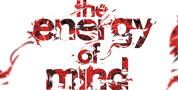
If you are still unconvinced about the beauty and power of visual, please take this example. What do you think that is more memorable, this quote- “The energy of mind is the essence of life” or this artwork? I guess that the last option will be your answer. The designer wisely played with colors and types- he used black, white and red that assured a very powerful contrast, making everything obvious. Still, he fades away some parts of the letters to create a mystery scene.
Youtube Brazil – Carnival Channel 2011
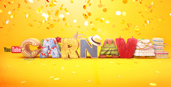
Playing with types may be an advantageous activity, for both the artist and the viewer. The designer is working on something enjoyable and relaxing, while the viewer will be impressed with the designer’s work. It’s the case of Florence Dagostini that added into this project a lot of creativity and humor and we all were impressed by it. It’s a great work, isn’t it?
Greymatter & KRL
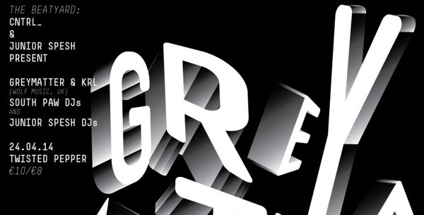
This poster is a good example of what “pixel perfection” means. Each pixel is carefully studied and consequently, the project is beautiful. Also, the 3D effect of the letters is well done and manages to attract the viewers’ eyes.
Seven
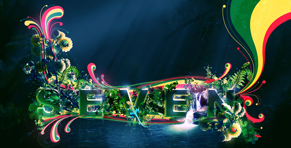
Text effects were always much appreciated and many designers gained the recognition of the community by creating amazing typography projects. This project looks extremely well and it’s our duty to congratulate the creator. Do you like this work? Please share your opinions with us!
Nesian Street
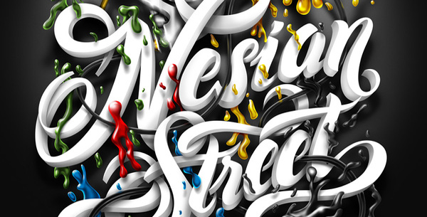
Nesian Street is an astonishing project. It combines the handwritten fonts, a classic component, with 3D effects, a modern aspect. The combination of these two opposite entities is simply amazing even if I was initially skeptic about it. The small details reveal that this design was crafted by a good designer and it’s no wonder why it was uploaded on the creator portfolio.
7th July 8th August
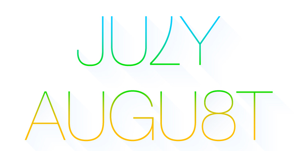
Flat design makes the ultra-thin fonts very famous. Personally, I am a big fan of them and I fell in love with this amazing project. It’s not only the font chosen that determined me to add it here, but also the colors used, which are really great. Many congratulations to the creator!
Hope
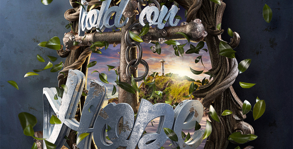
Playing with the types implies the use of creativity and this project perfectly sustains this idea. The designer creates a fantastic framework and the icing on the cake is “Hold on Hope”- a positive message, for which a great font, carefully polished, was used in order to impress everybody.
Crazy on the Dance Floor
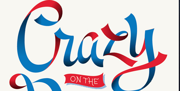
“Crazy on the dance floor” is a great typography project. Many designers commit an unobservable mistake that at the end has a very negative influence. It’s about the lack of congruence between the design and the message that has to be transmitted. “Crazy on the dance floor” is a slogan that inspires…well, craziness. The designer smartly used a “crazy” font and impressive text effect skills that are perfectly matching the slogan. Imagine this project using another font. Do you think it would have the same success?
Reasons to Love New York
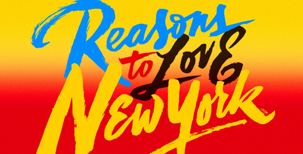
Into a design project, types can’t “live” isolated; these “interact” with other entities. In this work, the relationship between letters and colors is great and the final result is really impressive. The joy of colors and the graffiti font make a great team and inspire the idea of spring time. Just like in the case of the previous project, the perfect match between design and message is the recipe for success.
The ABA Journal: Blawg 2013
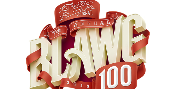
We have mentioned on various occasions, that the small details make the big difference and Blawg 2013 cover artwork is a living example that demonstrates this idea. It’s impossible not to remark the fine details and the wonderful and precise 3D effects. What do you think? Isn’t it perfect?
Believe In Each Other
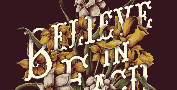
Vintage style is always appreciated; it has a special hidden beauty that is hard to describe. A better way to understand the vintage approach is to admire projects inspired by it. Believe in each other is a cool vintage work that impresses any viewer. The interesting combination of flowers and letters is another huge plus of this work.
Music & colorz
I guess that this design will make everyone say “wow”. It’s fascinating how the designer played with the depth of the field and 3D effects. Also, the colors used are very pleasant making the whole thing a pleasure to admire.
JOKER
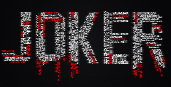
This kind of design project isn’t a novelty for the community, but the realization is superb. Personally, I think that the “red words” aren’t necessary and the design would look more balanced by respecting the shapes of the letters forming the word “JOKER”.
Kyle’s Dreams
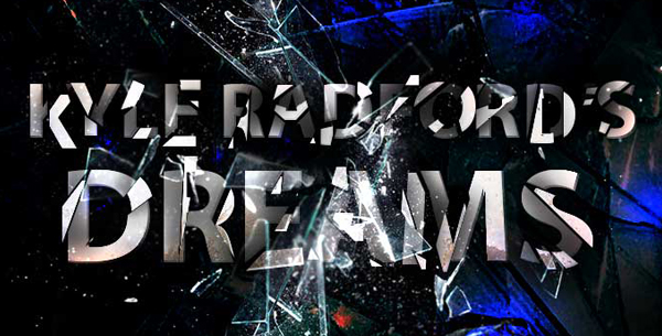
Kyle’s Dreams is a great typography project. The designer skillfully played with 3D effects and used pieces of shattered glass to create a fascinating environment. Definitely, it was a great endeavor of the designer because each letter is well rendered and wonderfully affected by the glass.
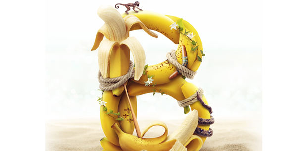
Navy Subs
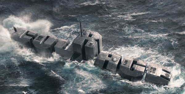
Personally, I consider this project the most original one from this collection. The designer uses letters to draw a submarine; moreover the letters form words, such as “courage” or “determination”. Also, it is impressive how well combined are the sea and the submarine- the overall image seems very realistic.
I Saw What You Did
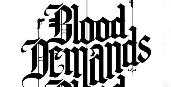
If the previous item was a project where typography elements were involved, this one is a pure typographic project. It’s impossible not to fall in love with the fine lines and curvatures of the letters. It’s nice, mysterious and very attractive and it fully deserves its place into this list.
Tantalizing Type
It was showcased in this post that the types may be used in almost any kind of project- from vintage to military influenced ones. However, it was neglected the fact that letters may be funny. Anyways, this work is the best evidence. Don’t you think?
Typography
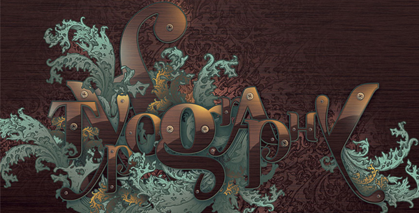
Typography and creativity blended together are the fundaments of a good design and this project fully demonstrates this idea. Altogether, there is more than that- the designer is very skilled and he / she takes this work seriously.
3D Typography
When I started to write this post, I wanted to create a list containing a large pool of techniques that will help you play with typography. Even if there were exhibited many 3D projects, it was impossible not to add this project in this list.
Candy Cane
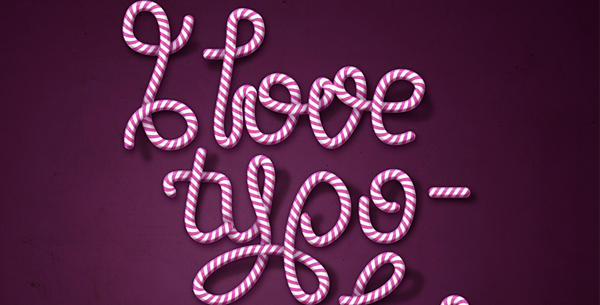
Candy Cane was purposely added the last item into this list. It expresses sweetness, elegance and joy and I hope that this poster will boost your good mood and productivity. Of course, its pleasant use of typography is noticeable, too!
These projects are created by talented designers and they invested much time and resources to delight us. Consequently, it’s our duty to reward them by visiting their portfolios or social media profiles. Another important type of reward is to share the post with your friends, if you enjoyed it!


 The Anatomy of Great Website Design that Google Loves
  11 WordPress Design Trends for 2019
 How You Can Boost Conversions with Minimalist Web Design
  7 Graphic Design Tools for Non-Designers
  Set of 50 Free Web Design Icons