There are numerous decorative solutions of how to effectively jazz up your interface design, giving it a jaw-dropping appearance, however, when it comes to mobile interface prototyping, not all of ornamental tricks are appropriate. Certainly, the main reason is a small dimension of mobile screen that imposes some restrictions that need to be taken into consideration.
Thus, you have to balance between eye-catching design and perfect readability characteristics. Surely, every designer finds out its own approaches that help them effectively to sort out this issues, and today we are going to take a look at mobile app interfaces that includes components made in a nifty contour style. As it turned out, it is a quite productive and elegant solution which meets all requirements.
Such type of graphics become quite popular with the advent of iOS 7, when backgrounds become smoother and type got more primitive and sharp outward. The designers employ line style in different purposes: icons, form fields, even buttons are made in this elegant manner. And this is not surprising, since this subtle style is able to add to your design sophistication, refinement, clearness and, what is more important, lots of free room that is quite rare phenomenon in small screens.
They also maintain a simplistic feel, livening up the content and providing more aesthetic formatting. Besides, it is pretty easy to reproduce, so it has become quite essential tool.
Showcase of Contour Style in Mobile App Interfaces
Hostel app for iOS7
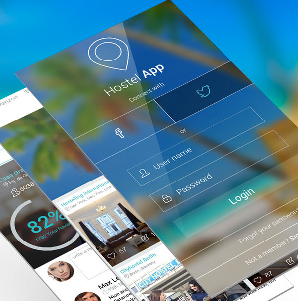
One of the functional screens features a magnificent login form that is made in a nifty contour style. The heavily blurred background beneficially underlines the white elegant typography, tiny graphics and neat thin fields.
iOS 7 Icons Color Fluo & Golden Night
![]()
This mobile screen depicts a set of amazing vibrant icons that have lovely neon feelings. The line style gives each item a sophisticated outward while color palette helps to burst them with some energy. On the whole, the pack looks absolutely fantastic and definitely eye-catching.
iOS 7 icons Redesign
![]()
This is another amazing example of icons’ solution. Much like the previous example, the designer has decided to leverage a subtle line style in order to give the set some prominence. However, there are no garish tones or neon touches, only clean light shapes and regular type that all together looks absolutely refined.
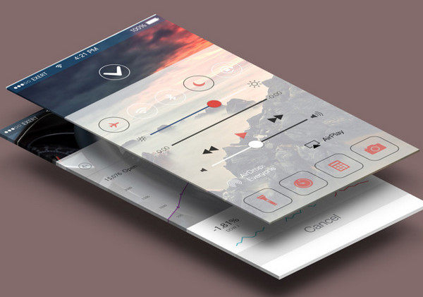
Control Center
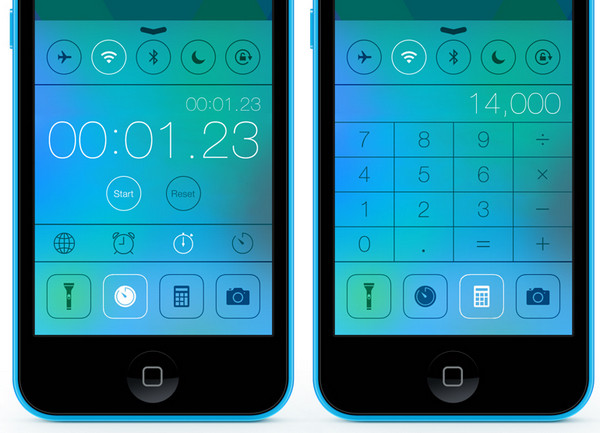
Highly resembles new iOS7 interfaces with smooth blurred backgrounds and sleek foreground items. Here, the designer also adopts an approach of employment outline components that wonderfully collaborate with ultra-narrow, slightly elongated font and several solid icons.
Pilot TV App
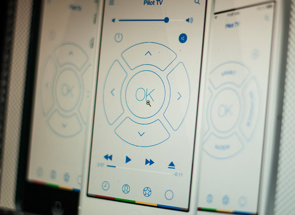
The designer skillfully utilizes a minimal approach both in coloring and essential graphics. Thus, the interface looks truly clean and accurate mainly due to an excellent combination of businesslike blue and modest white colors that are bolstered by crisp outline components.
iOS7 Theme
iOS7 Theme by Patrick Cabral can boasts about its futuristic, high-tech look. The designer skillfully utilizes a heavily blurred dark background that serves as an ideal foundation for glossy semi-transparent widgets and white typography. Every functional component has an obvious contour style.
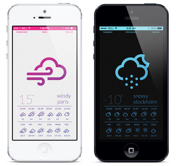
Tint
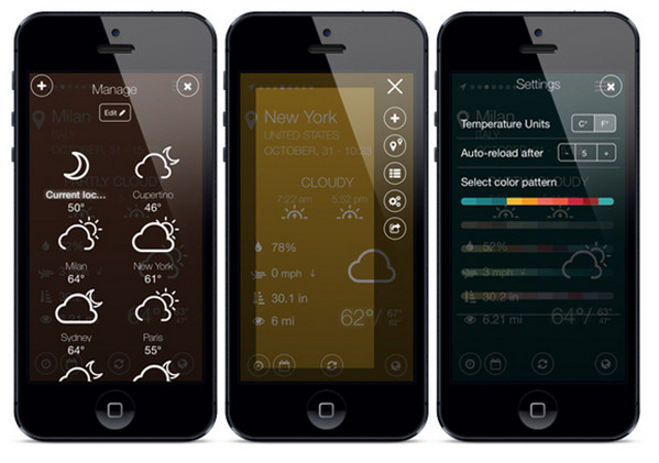
Tint is a standard forecast application interface that, like many others, leverages intelligible icons in order to avoid unnecessary visual clutter and give an immediate notion about weather conditions. Each icon is made in a slick line style that capably enhances the visual experience.
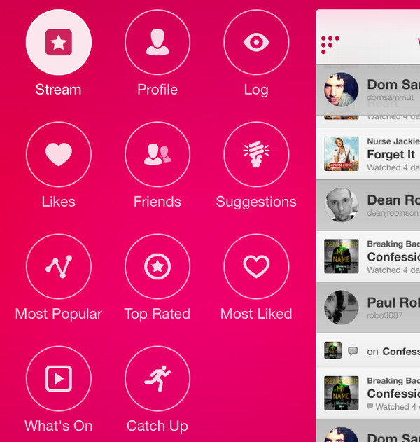
Calendar App
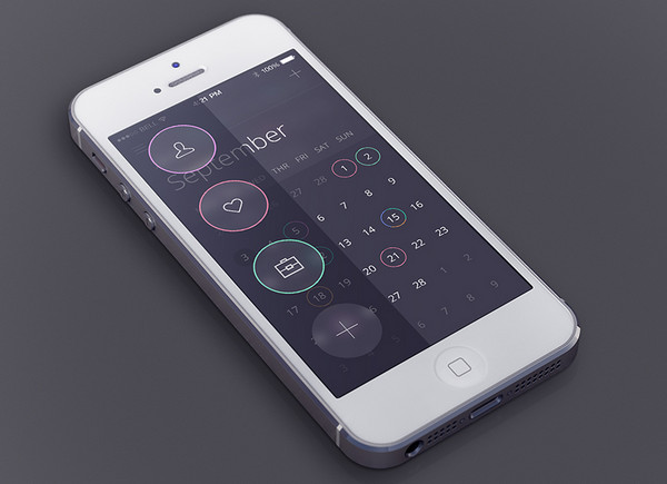
As the practice shows, majority of such mobile app designs prefer to employ a neat refined contour style in order to display its information-overloaded screens in a more organized way. Usually, such interfaces implement well-structured grids, tiny legible type and of course, line style in order to make it look clutter-free.
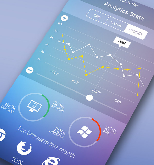
iOS Stats App
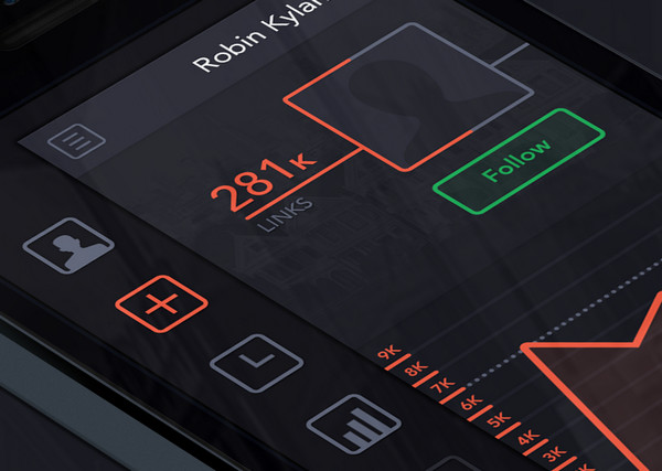
The designer easily achieves an overall balance by means of minimal coloring and crisp smooth graphics. The line style in tandem with two bright colors (red and green) produces a quite impressive result.
iOS 7 Calculator Concept
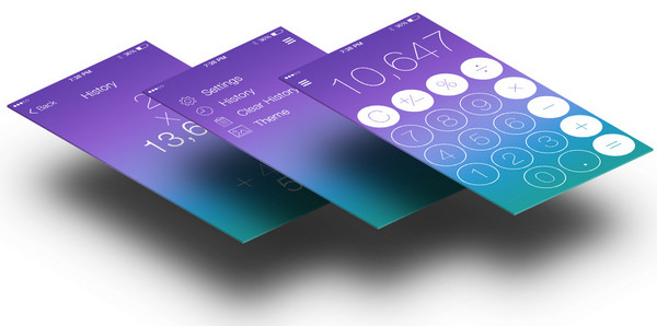
This juicy concept has a modern and sophisticated appearance. The garish gradient background skillfully emphasizes foreground elements, making them look radiant and legible. The designer has wisely chosen white as a prime color and contour style as a basic decoration tool since they both provide a quite sharp contrast here.
iOS7 Concept
iOS7 Concept features a regular control center that comprises standard settings, music player and of course, a set of basic icons. The latter ones are made in an elegant line style that perfectly matches the tone of interface.
iOS Breaking Bad Concept
Much like examples number 2 and 3, this concept also represents an amazing pack of clean sophisticated icons. The dark greenish uneven background effectively emphasizes outline light icons and sharp type.
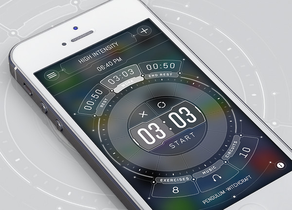
Fitness App Dashboard
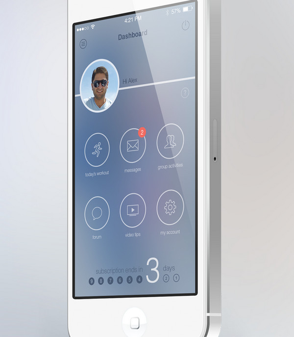
Fitness App Dashboard by Alex Tarloyan looks smooth and a bit pale mainly due to coloring and background, though selected tones perfectly interacts with each other. The outline components ideally fit into composition.
Notification Center for iOS 7
The functional screen includes several line style components that add a note of elegance and neatness. They wonderfully balance with a bluish background and other solid elements.
Lock Screen Concept
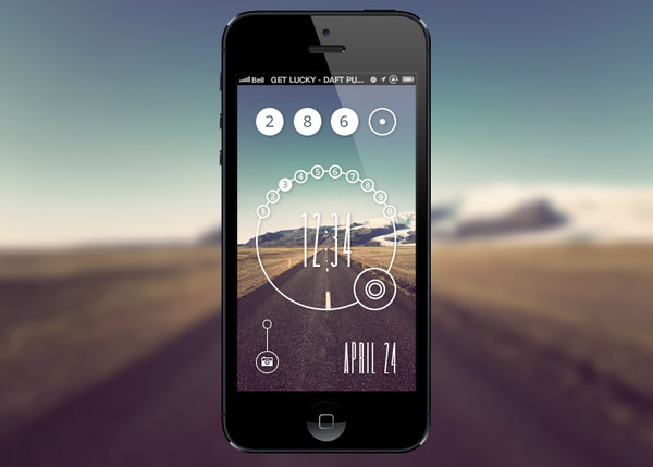
Lock Screen Concept by Eli Williamson has a spectacular circular vibe that is perfectly bolstered by a refined ultra-narrow type. The interface looks absolutely harmonious and up-to-date. The contour style along with a circular shape makes a lovely couple.
Rating App
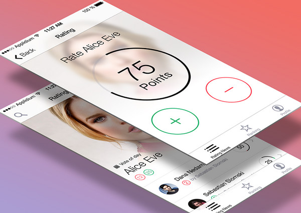
Rating App by Dana Nedamaldeen has a light clear interface. The designer ably uses various outline components that naturally complement the design.
Cyclists App
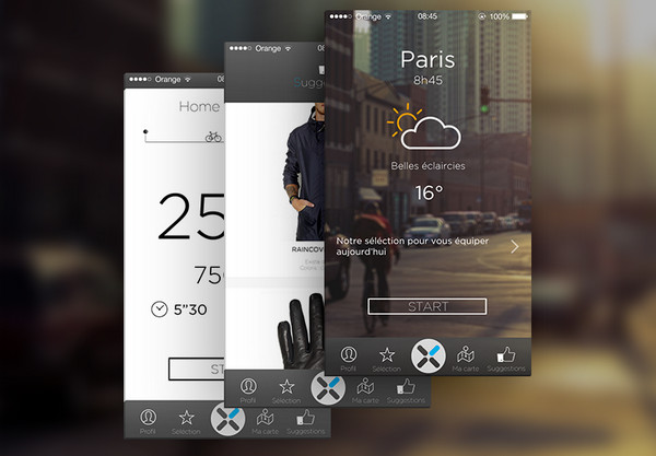
The various basic interfaces are based both on solid color background and photo background that beautifully highlight subtle type and bold contour style elements. The latter manages to pull off a refinement feeling with ease.
8 Ball for iOS 7
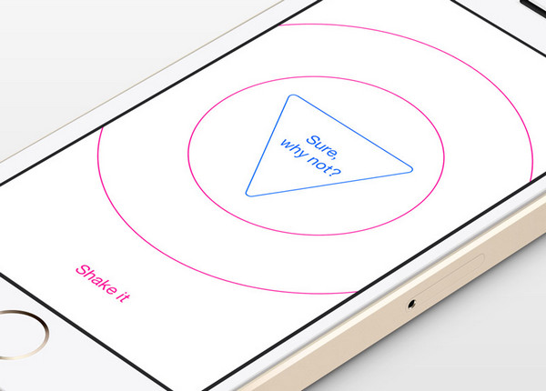
The designer skillfully puts a minimal approach to work, making the interface look a bit primitive. There are only several graphical components that effectively support the idea.
New Menu 2
The menu concept productively avoids a visual clutter and at the same time, provides a perfect user experience on a small screen. The designer offers a conventional layout where each key has its own distinctive place; and circular shape together with line style effectively contributes to it.
iOS Stats App
The interface simply screams out sophisticated iOS7 style. The designer took the best features of it, nicely mixes together subtle blurred background and light slick components.
Weather iOS7 Concept Design
This is another forecast app interface in our collection that effectively utilizes outline icons in order to clearly indicate a current weather status.
Reflection
Although, contour style seems to be quite tricky to implement, since you need to reckon in a contrast and balance between graphics and background, it is able to produce a pretty impressive results, making your designs look sophisticated and awe-inspiring.
Do you prefer to use outline or solid icons? Why? Share with us other creative examples.


 Teamstack: Team-as-a-Service Provider with Convenient and Secure Solutions
  The Anatomy of Great Website Design that Google Loves
  11 WordPress Design Trends for 2019
 10 Web Development Trends to Pay Attention to in 2019
  Freebie: 50 Vector Human Resources Icons
Shawn Rubel Apr 9, 2014, 4:39 pm
Hey Nataly,
this is some really inspirational stuff you’ve put together. I’ve been working with my mobile designs in the past couple of weeks, and most of these interfaces is something that I’m looking to mimic in one way or another, so thanks for taking the time to share this!
// still can’t believe how many of my friends are ignoring iOS7, haha
– Shawn